 I was cleaning off my cutting table—okay, I’ll admit, I was trying to clean off my cutting table. Someday I’m going to be successful. I hope that day is soon!
Anyway, I found a brown jersey I remember buying at the old Buttons ‘n’ Bolts in Tucson about 10 years ago. At the time I was going to make a long tank dress as the canvas for a brown art-to-wear jacket that existed in my mind. Neither ever got made.
Now I’m making lots of knit tops, so I grabbed the brown jersey (probably pima cotton, shot with black, deliciously soft and comfortable) to make another version of Katherine Tilton’s Vogue 8817, view C/D. (To refresh your memory, here are versions 1 and 2. And here are posts of both views A/B and C/D. All of ’em.)
Now look at this geometric print top. See that funky felty lace that I used for the neckband and the sleeve embellishment? That’s what I thought I’d use for the accent inset on the upper front and for the sleeve insets on this top. But when I held it up next to the brown jersey, I didn’t like it at all. They weren’t the same brown, but they weren’t compatibly different browns, either. I dug through my scrap knits box and realized I had enough of the geometric print knit from Mood Fabrics to use for the insets.
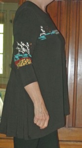
 Here’s where I did okay, but could have done much better. You’ll notice on the sleeves of the finished dress (top photo, above – click to enlarge) that the insets are easy to see. However, on the upper front, you only see the white circles and the turquoise blob (photo on right). Above the circles, there is a band of brown with caramel dots. But there is not enough contrast between the brown-with-caramel and the brown jersey above it.
In retrospect, I should have been more careful in my placement of the top inset pattern piece to ensure that the patterns underneath it were going to have enough contrast to the brown jersey. Then it would have been perfect (she smiles).
 Another point I want to make on this third go-round is the difference in length between the front and the back.
I think I’d like a little less difference. I like the length of the back, and maybe the front could be a little longer. Why isn’t it? Because I’m a little too busty. My large cup size takes up some of the length. If you’re a B cup, your side view will be like the side view on the pattern illustration. But if you’re greater than a B cup, there’s going to be a bigger difference in the front and back—possibly as much as an inch per cup size (i.e. C cup = -1 inch; D cup = -2 inches, etc.).
If you wear a larger cup size, consider lowering the center front by an inch or two and gently tapering it up from the side seam. A French curve ruler would be an excellent tool to use when drawing the tapered line. Or, you can do a vertical Full Bust Adjustment (FBA) as my cyberfriend, the brilliant and inspiring sewist Shams details on her blog.
To finish our little discussion of contrasts, look at the black leggings with this top. When I finished the top, I reached for my white piqué Eileen Fisher cropped pants. But they’re white, and the circles in the inset are off-white. Nope, wouldn’t do. So I dug in the drawer and pulled out a pair of brown leggings. But brown is such a fickle color. The browns were different and there was no way I could put them together and hold my head up in public. I even thought of using the remaining brown jersey to make a matching pair of brown leggings. But then I envisioned that and immediately said shouted “No – too matchy-matchy.” So I grabbed one of several pair of trusty black leggings, and I think it works.
While it makes for a very dark outfit, I think the shoes (Yippee! – new Naot Matai’s in Copper Leather) bring enough brightness to offset all the darkness.
Next time – more care with pattern placement when adding accent fabrics.
And tomorrow: something new. I downloaded a free t-shirt pattern!


